Family Parks
Rebrand, Logo, Brand Design, Marketing Strategy and Websites
Family Parks was looking to increase it’s market presence and profile within the Caravan and Camping Industry. As one of the top 3 holiday park chains in the country, and the only group with parks in New Zealand, it’s brand and corporate image needed a refresh to reflect it’s status, growth and strength – both for it’s parks and for it’s travelling members.
The old brand had been held for over 10 years and the design style used on all the marketing was dated, washed out, and didn’t accurately reflect the style of holidays and service the group of parks provides travellers, or the strength and professionalism of service Family Parks provides to it’s parks.
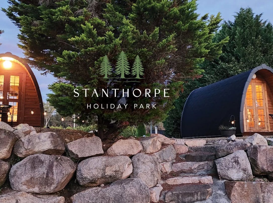
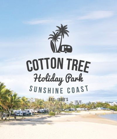
Amanda designed a new logo, along with a new suite of branded materials, park signage, style guide and marketing plan to better position Family Parks in the market place. The outcome was a new take on the old logo, with a bold bright logo in 3 colour versions (to suit the 3 areas of business), delivering a corporate identity and range of marketing materials that now incorporated striking, fresh and relevant landscape and lifestyle imagery – appropriately more reflective of the industry, the great destinations, and the ‘back to nature’ and ‘outdoorsy’ appeal of the Holiday Park style getaway.
Three areas of business were rebranded – the travel rewards membership program, the B2B Family Parks corporate brand, and the (B2C) Individual park branding elements that were rolled out across all 100+ parks.